
How Professional Photography Can Transform Your Creative Career
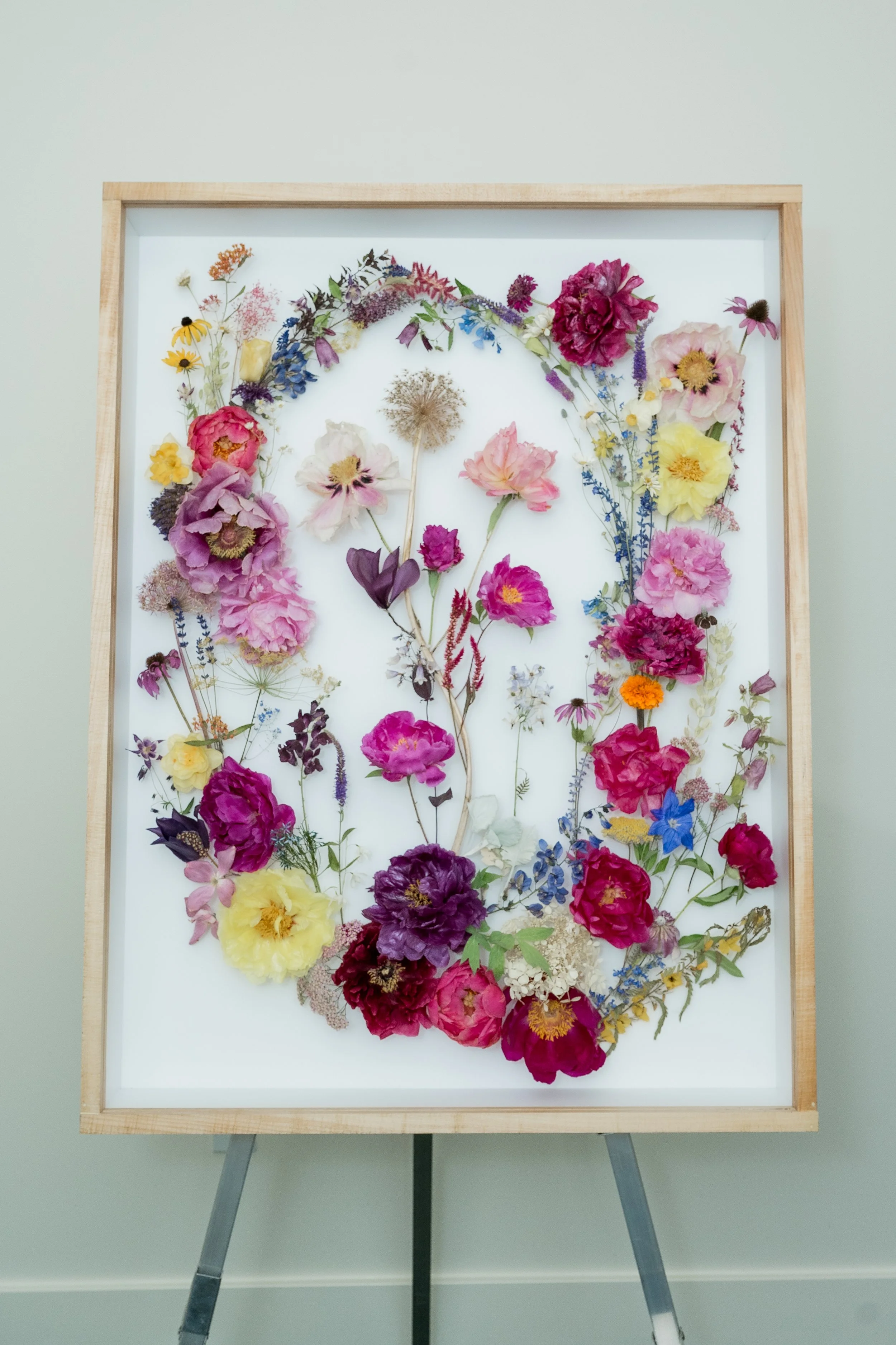
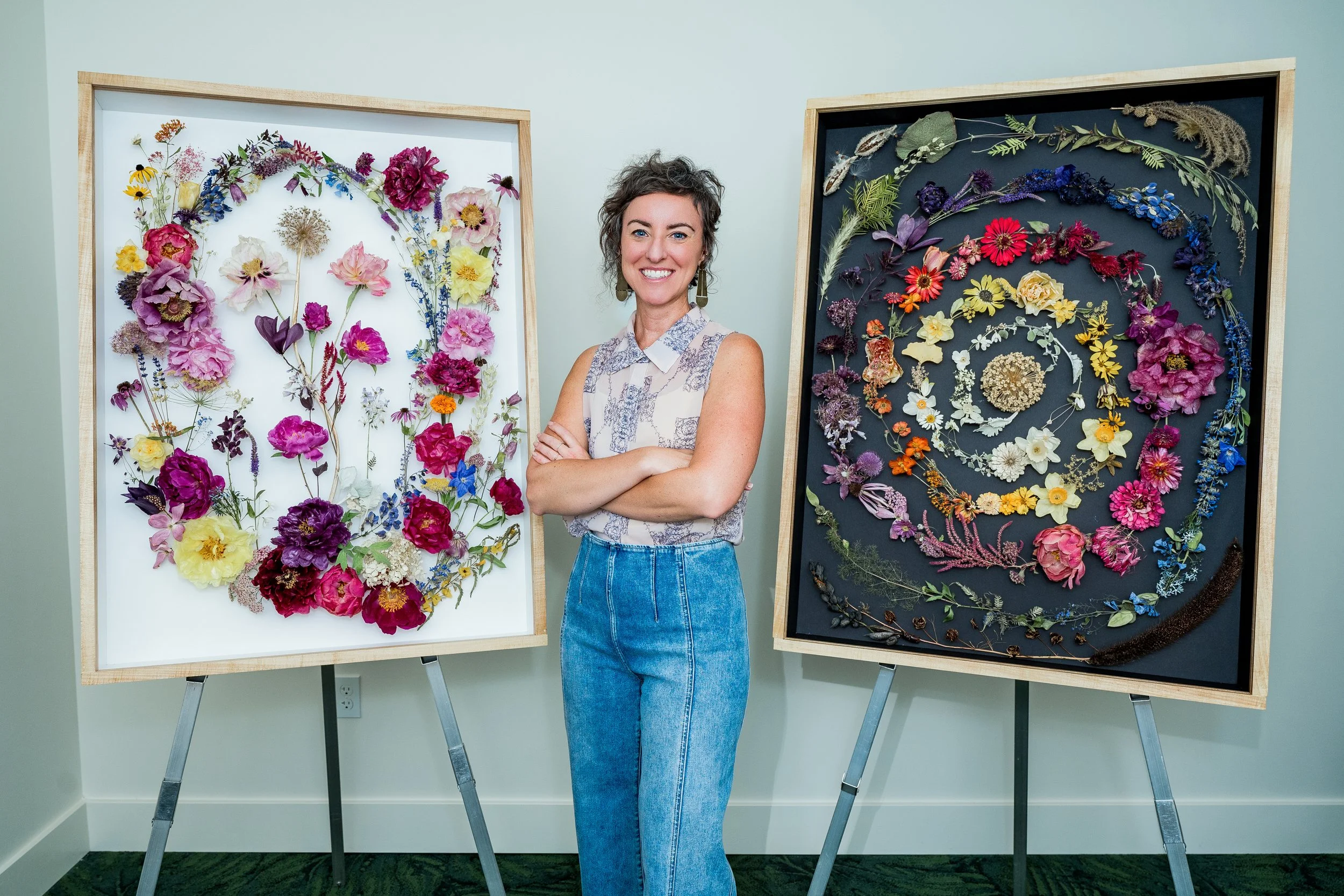
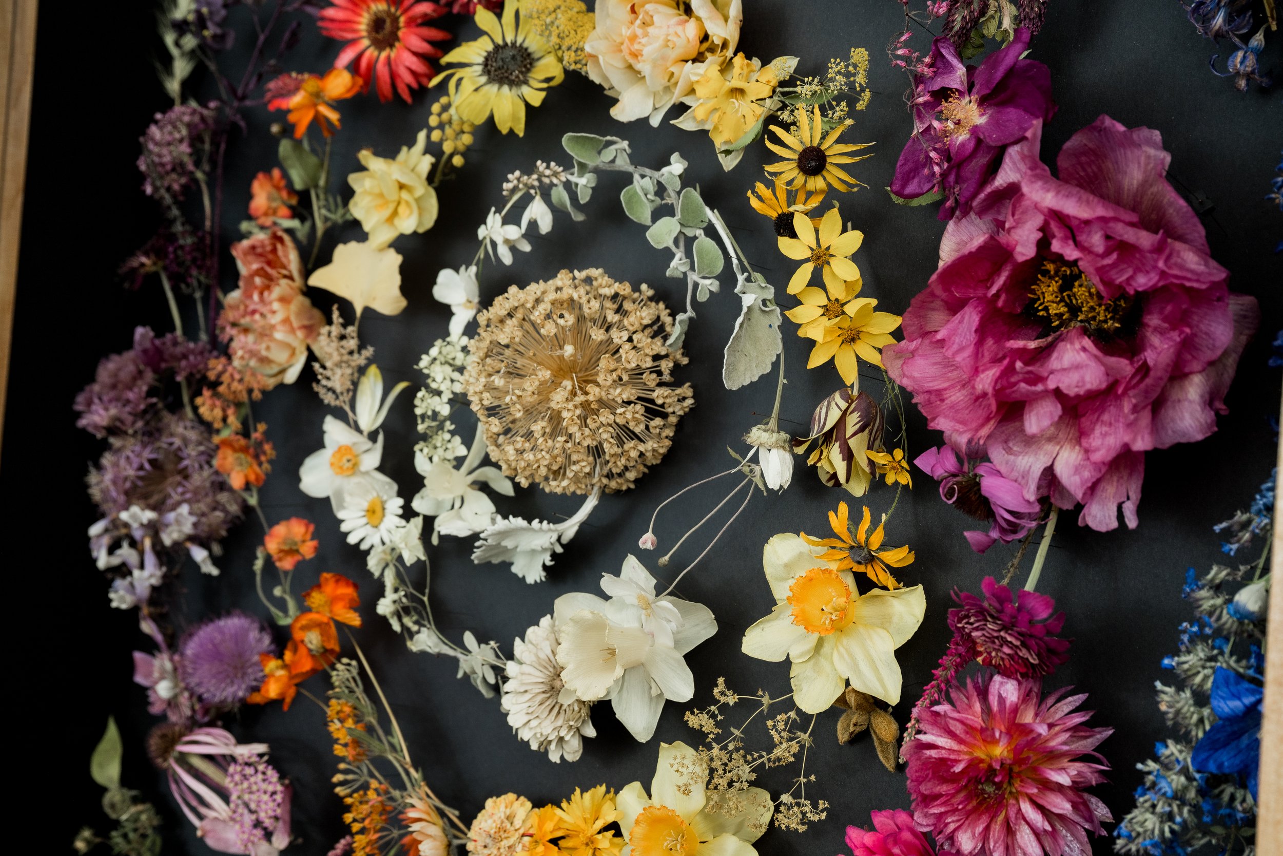
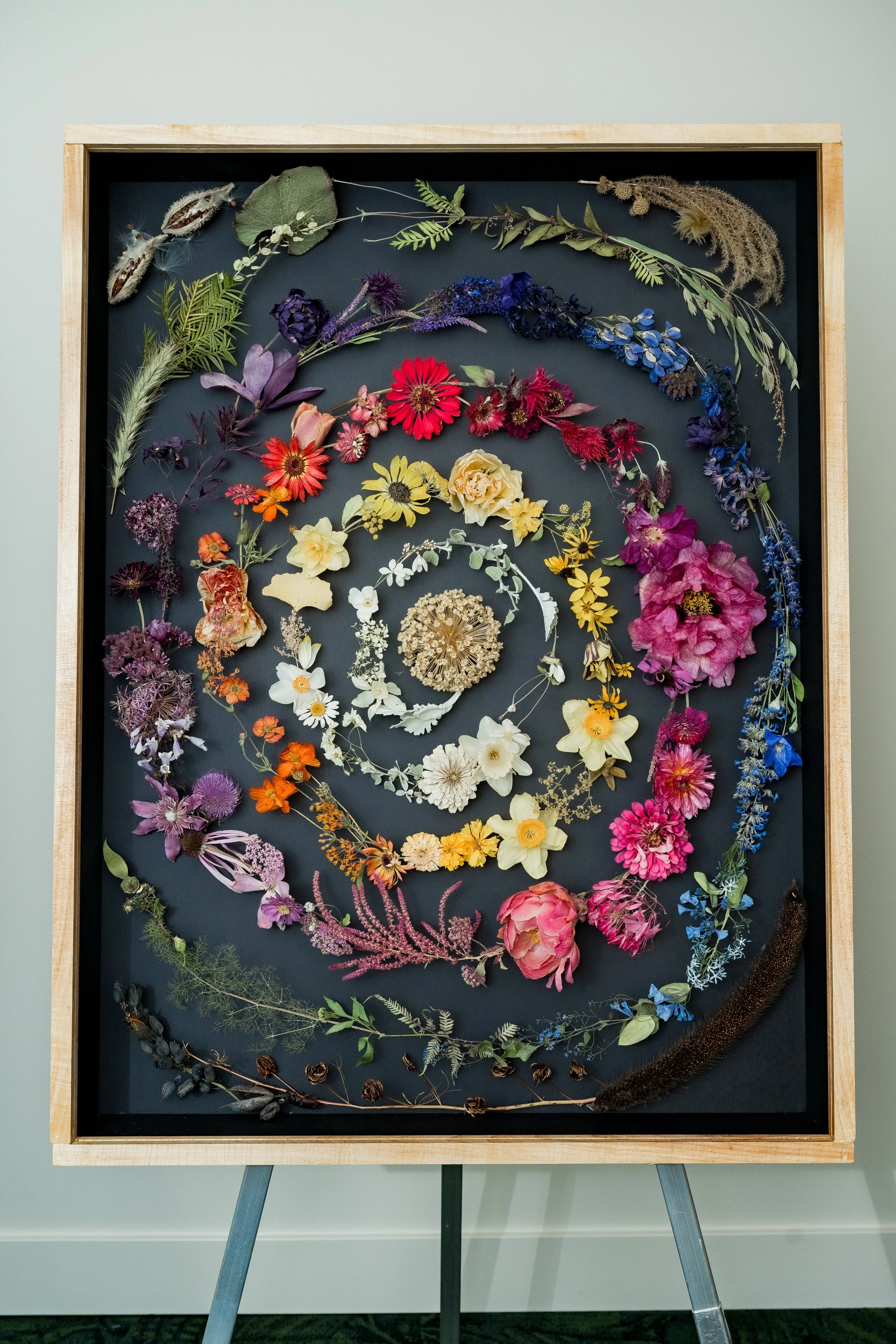
Art by Secret Gardens CU
Independent artists, makers, and freelance creatives often post great work but still feel invisible when it’s time to book clients, land shows, or pitch collaborations. The tension is simple: scattered photos and mixed-quality images blur visual identity in art careers, so the work looks less consistent than it really is. Professional photography for artists brings order to that chaos by giving personal branding for creators a clear, repeatable look that audiences can trust at a glance. With stronger artist audience engagement, the work starts supporting creative career development on purpose.
Quick Summary: Why Pro Photos Matter
Use professional photography to upgrade your branding with polished, high-quality imagery.
Use strong visuals to build trust and create a clearer connection with creative audiences.
Use consistent, professional images to present your work confidently across your portfolio and channels.
Use elevated visuals to stand out, attract better opportunities, and move your creative career forward.
Polish, Resize, and Upscale Photos Without Re-Shooting
Those six benefits land faster when your images look consistently sharp everywhere you post. AI image optimization tools can help you enhance, resize, and format professional photos for different platforms so your visual identity stays polished across your website, social media, and portfolio. Instead of settling for soft, pixelated enlargements (or planning a whole new shoot), an AI image upscaler increases resolution and improves clarity, letting you scale up photos while preserving detail and overall visual quality.
That means your work can hold up whether it’s shown as a wide banner, a square crop, or a portfolio-sized image, helping you keep audiences engaged and reinforcing your personal brand with clean, confident presentation. If you want a clear example of what this looks like in practice, the Adobe Firefly AI picture upscaler tool is designed specifically for enlarging images without the usual quality drop.
Understanding Visual Perception in Your Brand
In practice, your brand is a perception people form from every touchpoint, especially your photos. Clean, intentional images signal care and clarity, so viewers assume your work is equally thoughtful. Photography also guides attention, setting mood and meaning before anyone reads your bio.
This matters because trust is often decided in seconds. When your visuals look professional and consistent, you reduce doubt and make it easier for someone to follow, book, or buy. Strong imagery also boosts recall, so your style sticks in a crowded feed.
Think of it like walking into a well lit studio versus a cluttered garage. The same tools might be inside, but one space earns confidence faster. A quick brand audit can reveal where your photos are helping or hurting that feeling. With that in place, simple shoot rules can keep your story and look consistent everywhere.
Build a Cohesive Look: A 7-Step Photo Playbook
Your audience makes snap judgments fast, so give them the same “you” every time they see your work. Use this simple playbook to turn professional photography tips into a cohesive visual identity and a clear creative narrative through images.
Pick your “home base” mood (3 adjectives): Choose three words that describe how you want your work to feel, like warm, minimal, grounded or bold, glossy, electric. These words become your filter for every photo decision: lighting, locations, styling, and edits. This works because perception is pattern-based; consistent cues help people recognize you without thinking.
Lock one color rule you can repeat: Decide on a tight palette: 1 hero color, 2 supporting neutrals, and 1 “pop” color max. Then apply it to backgrounds, props, outfits, or even the tones in your environment so your feed looks like it belongs together at a glance. Brand teams note a consistent color can increase brand recognition by 80 percent, so this is one of the highest-impact “small knobs” you can turn.
Build a mini style guide (one page only): Write down your rules: preferred light (window/softbox), contrast level (low/medium/high), framing (lots of negative space vs. tight crops), and 3–5 “nope” items (like harsh overhead lighting or neon backgrounds). Keep it simple and printable so you actually use it when you’re planning a shoot. When people treat the logo as the entire brand, their visuals drift, your guide keeps the whole system consistent.
Storyboard a 5-image narrative for each shoot: Plan a repeatable set: (1) wide “scene” shot, (2) close detail of texture/tool/material, (3) you-in-process, (4) finished hero image, (5) a human moment (hands, face, client reaction, studio corner). This turns random posts into visual storytelling for artists: context → craft → payoff. You’ll also stop overshooting because you know exactly what you need.
Choose one lighting setup and master it: Pick a default you can recreate: side window light at 45° with a white wall/foam board to bounce, or a single soft, diffused light placed slightly above eye level. Mark the floor with tape so your subject-to-light distance stays consistent from shoot to shoot. Consistent light is the easiest way to make different locations still feel like the same brand.
Use “three anchors” to keep every photo on-brand: Before you press the shutter, check three things: background (clean + on-palette), subject (clear focal point), story clue (one prop/gesture that explains what’s happening). Example: a painter’s portrait becomes a story when the anchor is a paint-stained rag or a brush mid-stroke. These anchors create building artistic brand consistency without making everything look identical.
Batch, then edit with rules, not moods: Shoot for 60–90 minutes, then pick 10–15 keepers and apply the same 2–3 edit choices every time (exposure range, warmth, contrast). If you’re outsourcing, send your one-page guide and 3 reference images so the look doesn’t drift. You’re training your audience’s perception, and your own workflow, to expect a consistent visual signature.
Build Career Momentum With Professional Photos That Match Your Brand
It’s tough to grow a creative career when the work is strong but the images feel scattered, inconsistent, or a little “last minute.” The fix isn’t chasing fancy gear, it’s treating professional photography importance like a repeatable practice: plan with intention, keep a cohesive look, and let visual communication in art do the heavy lifting. Do that, and branding for creative careers gets clearer, artist career growth feels steadier, and engaging audiences with imagery becomes more natural across every platform. Consistent photos make your work easier to trust, remember, and share.