What Logo Versions Should Businesses Have & Use
I recently had a friend and client ask for some help with a logo that needed to go on a sponsorship t-shirt design. They were having trouble with some submitted files and it got me thinking about all the times I’ve run into this as well. It doesn’t happen so often within my business as it does within my community and organizations I’m part of, but definitely still an important conversation worth having!
You may remember a few years back I did a “soft” rebrand with a new logo suite from my (now) friend and graphic designer, Mike of Hagan Design Co. I was really pleased with the experience I had with Mike and the file suite he provided for me. I thought a discussion about file types that small businesses should have on hand for their logo needs could be useful to my readership.
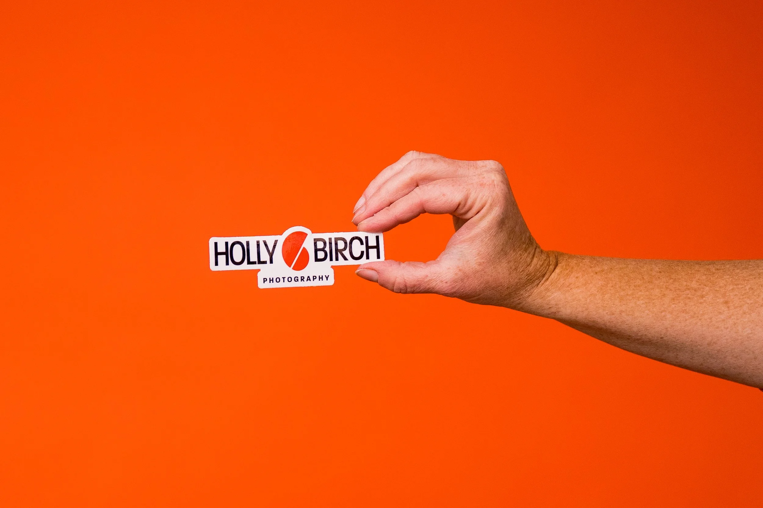
So here we are! I sent Mike a few questions, and boy did he deliver! He also sent a few of his own photo examples to illustrate his points and showcase some of his own work, and all the photos of mine in this post show me using the logo he created in various forms (shirts, stickers, etc)

My logo from Hagan Design Co on a ¼ zip shirt
When a business gets a new logo designed, what are the core file formats they should walk away with, and why does having multiple formats matter in the first place?
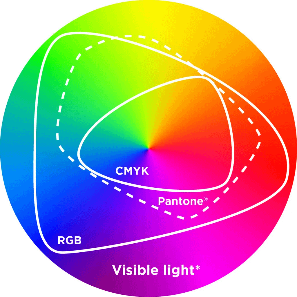
First we need to talk about what different types of file formats there are. In logo design, you can get both raster and vector. In the simplest terms, raster = pixels on a grid, vector = plot points and a set of instructions. Raster files are things like JPG, PNG, and lesser-used ones in logo design like GIF and BMP. Encoded in the raster file, it will just simply say "paint pixel number 504,971 this shade of orange". This means if you zoom in far enough, you'll see the squares. The image can't invent new detail that wasn't there — it can only stretch the dots it has. With vector, it uses math to say "make this circle with a radius of 50 points and fill it in with red." No matter what the size, the vector can scale up or down and not lose resolution. It is using math, not set amount of pixels on a grid.
This is not to say raster files don't have their place. If your logo uses intense gradients, textures, or some more real-life photographic elements, pixels win out here. The real world is too complex to describe in math.
One version of my logo stickers
So you should get both vector and raster files. The raster files you should get are PNG and JPG. Increasingly, I am not seeing a need for JPG, because you can usually use PNG in its place 99.9% of the time. The difference between PNG and JPG is that PNG allows for transparency. That means instead of your logo on a white background, you can have your logo on NO background, which is great for overlaying your photos, videos, and brand patterns. JPG does not allow for transparency, so if you try to lay the JPG of your logo over a photo, it will have a white background. This also means that if you have a white version of your logo, the background and your logo will be the same, so it won't be seen. But you can make a white version of your logo in PNG and you can lay it over dark colors. I can make you a JPG of your logo in white on a dark background, but I will never be able to choose every possible color background for your purposes to match, so a transparent PNG is way better for this.
One important caveat for PNG: it doesn't support the CMYK (print) color space, only RGB. JPG doesn't allow for transparency, but does support the CMYK color space. If you need all three: raster format, transparency, and CMYK support, the best option is TIFF (with some hard caveats that it's not the most supported file format out there and you may run into some issues with it).
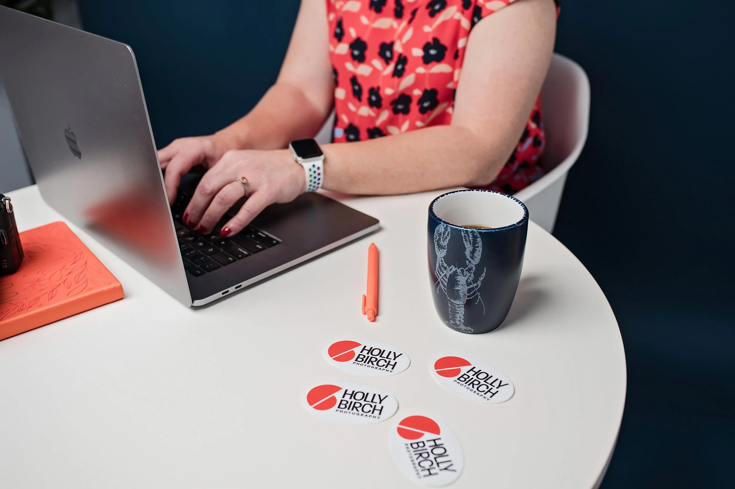
Some of my stickers at work in one of my own brand photo sessions
The vector files you get should be PDF, SVG, and sometimes you might run into needing an EPS, which is why I usually deliver them. SVG stands for Scalable Vector Graphics and it is essentially web code. It is designed to be rendered in the browser and can be opened in other graphic programs, to varying degrees of success. Usually if it is opened in the program it was created in, there are no problems, but they can have issues in print workflows. EPS is the older, simpler brother of PDF, which means it's more like a program that runs instead of a file to be used. It can hold vector, raster, and text in one "file," but when opened, renders all those things from its instructions. You shouldn't need EPS except for older print flows. I've run into some embroiderers that required it for their software, but modern shops should be able to accept PDF.
Which brings us to the most universal file out there for our purposes: PDF. PDF is the most universally openable of the three. Every operating system can render it natively, every print shop accepts it, and it previews correctly everywhere. When a logo is exported as a single-page PDF, it behaves much like EPS but without EPS's rendering quirks — the vector data is preserved perfectly, and it can also embed fonts and color profile information cleanly.
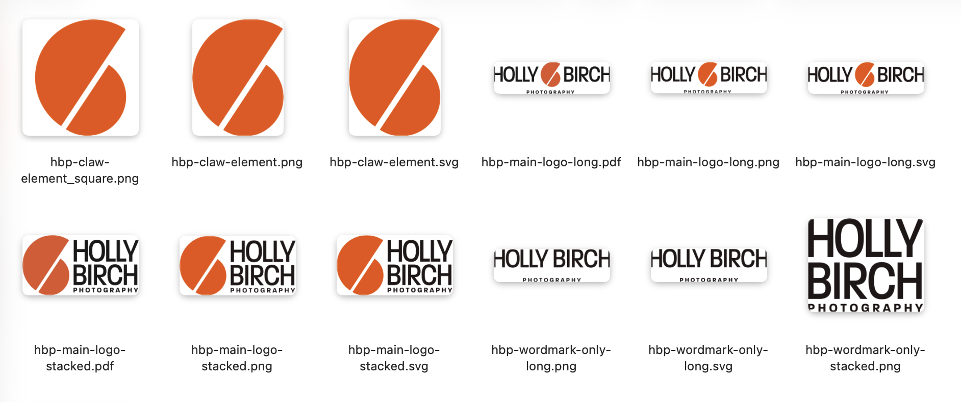
A glance at some of the files in the suite that Mike provided me upon finalization of my logo
As I've refined my export process for clients, I've been able to hone in on what they need based on our conversations and try to not overload them with files they won't use. I like them to have more than they think they'll need, but less than I could give them. I could export formats they'll never use and it wouldn't be worth the abundance of files they'd have to dig through to find later. I now folder the files for clients so they can choose what they need by following the path of what the final need is. Say they need a single color square layout vector file for a t shirt. They can choose the vector folder, then the CMYK folder, then the PDF folder, then the square layout folder, then the single color will be there with all the other CMYK color options of the square layout, and they'll have what they need.
Most people think of a logo as one image, but you'd actually recommend several layout variations. Can you walk us through the difference between a standard rectangular version, a wider horizontal lockup, a square version, and a textless icon-only version — and give examples of where each one gets used?

My main logo on a hoodie (hoodies and t-shirts with this logo serve as my everyday “uniform”!
Choosing the wrong layout for your logo is like fitting a square peg in a round hole...you can jam it in there, but it messes things up. You never ever ever (ever!) want to stretch or squeeze the logo to fit into a space. That's why I like to make multiple layout variations of the logo. They're all "your logo" but you can use them as a larger part of your visual identity system and when you do it right, they will all be equally as recognizable.
I make variations based on use-case and the initial design. If the idea started out in a square layout, I will build the other variations from that square layout. If it started as a horizontal layout, I'll build the other variations based on that. I will usually choose one to be the "main" and the other ones as variations.
Why would you need a version of your logo that fits inside a square? We're all on social media and almost every company has defaulted to using the circle as the profile pic. That's what your customers see most of the time when interacting with you. So if I build a logo in a square layout, I can place a circle with a diameter the same width as the square, and 9 times out of 10 the square layout fits in there and fills circle, therefore filling the profile picture area. If you're using the logo for your profile pic, you'll avoid the trap of trying to fit a square peg (long horizontal logo) in a round hole (profile pic area) and looking like so many other brands that have unreadable logos on white backgrounds as profile pictures.

A gif I made while wearing one of my ¼ zip shirts from LMJ Handmade with my “stacked” logo version
What I generally provide:
The "long" layout aka horizontal version: this is good for your website logo on desktop so your logo doesn't have to be tiny in your header, for letterheads, or swag like pens.
The "stacked" layout, aka square: The logomark (icon) sits above the wordmark. This is more compact in width and works well when you have a squarish space — app store listings, presentation title slides, the center of a t-shirt, or a square social media post. It also reads well at larger sizes like signage. I usually design this within a circle for the reasons listed above.
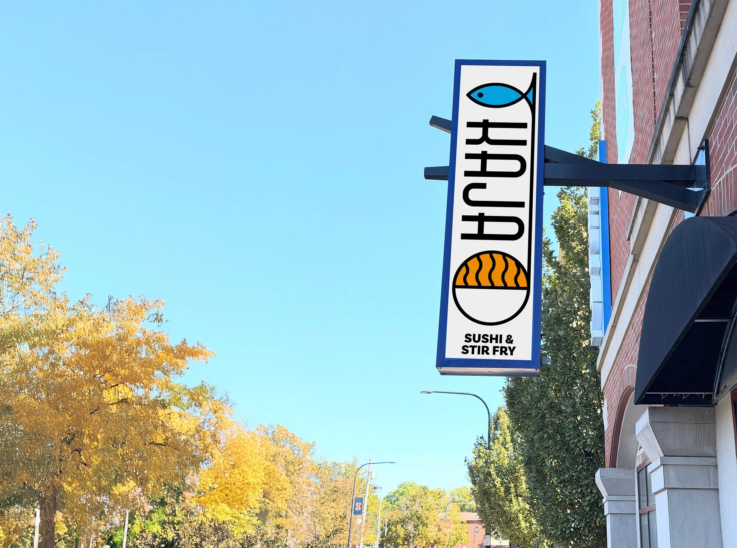
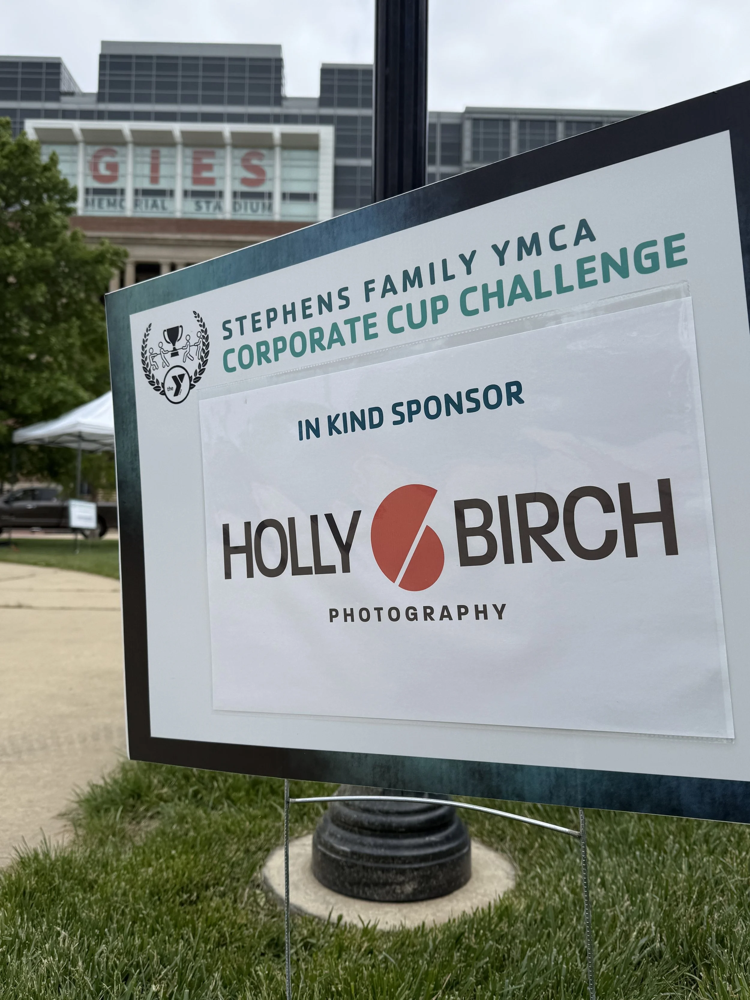
One of Mike’s logo designs on a sign in Urbana for Kaja
Icon-only / Wordmark-Only: if the logo has both, I will separate the pieces so they can be used on their own. Generally, unless the logo is a wordmark-only logo (text-based), using the wordmark alone isn't advisable, but it's there for you to have if you need it. The Icon (aka logomark) can be used as a graphical element to give a touch of your brand in spaces where the whole logo doesn't fit. Social media profile pics, browser favicon, etc.
Other layouts: I will make other layouts based on client needs. With the Kaja project (see right), they had an existing vertical sign that they wanted to use, so I made an extremely tall version of the logo to better utilize that space.
Without alternate layouts you end up with one of two bad outcomes: the logo gets stretched or squished to fit a space, or it gets scaled down until the text is illegible. Providing the right layout for each context means the logo always looks intentional.
Transparent PNG files and light/dark versions of a logo come up a lot in this conversation. Can you explain why a business that only has a logo on a white background is going to run into problems, and what situations call for a light versus dark version?
Your logo needs to work in your full brand colors as well as one single color. That can be your main brand color (Holly's orange!) or simple black or white. We've all seen that t-shirt with a load of sponsors on the back. Those are usually just in one color to keep costs down. The cost to screen print every sponsor brand color is untenable. I can always tell which logo had a single color version and which didn't. (And I can tell when the printer cared about tracking one down or didn't!) [Holly’s note: this very example is what sparked the idea for this blog post!]
I export single color logos in every brand color in the client's palette, and I provide guidance on which colors to use as backgrounds and which colors not to, due to contrast issues.
One issue with light vs dark: when you have a white logo on a black background there is an effect called halation where the eye perceives light colors as bleeding out onto the darker background. That makes lines and text look bigger than they are. Your logo can be a pixel perfect reverse of the black on white background and still look bigger to the eye. So we compensate by making a different version for white meant for dark/black backgrounds. Depending on how detailed the logo is, we may need to redraw it completely, but generally shrinking it by about 2%-3% is a good start. It depends on the size and where the logo will be most seen (screens cause more halation that print, for instance).
What about favicons — that tiny icon in a browser tab? What makes a good one, and why can't a business just shrink their full logo down to that size?
The tech behind favicons is a mess. There are different formats that different browsers look for and older browsers don't display them properly or at all. Browsers also automatically look for a file called favicon.ico at the root of a domain (e.g. https://example.com/favicon.ico) even without a declaration in the code, which is a legacy behavior that has stuck around for decades. The whole thing needs an upgrade.
My logo in use on signage with the YMCA
The best practice is to think about it from the start. Even if you're doing a wordmark, you might take the first letter of your wordmark and pair it with your brand color in a square to become your favicon. It has to be in a square, and they have to be super small. 16x16 is the default, but Google likes 48x48 for search results, retina-level monitors use 32x32, and there is as much as 512x512 for some modern uses. Your web designer can call all those different versions in code, but site builders like Squarespace usually automate all this and just let you upload a big version.
The key is to design it as a square! They will be stretched into a square if not, leading to bad results.
What are the most common mistakes you see businesses make with their logo files — things like low-resolution files, overly complex gradients, or missing formats — and what real-world headaches do those gaps cause for web or graphic designers like yourself?
It's a meme in the design world that the client will send you the lowest resolution version of their logo in the worst possible file format...like a Word document or PowerPoint. It's definitely happened to me and I've redrawn more logos than I care to mention just so I can get a good version for my purposes.
I would say please ask your designer to help you figure out what to send. A good one will answer the email or pickup the phone and help because they want their work to be shown in the best possible light.
Most of the common problems can be taken care of at the initial design phase: if your designer is a true logo designer, they will guide you in staying away from things that will cause you problems down the road. Gradients are tricky; they work great in our digital first world, but aren't the easiest to print and are impossible to embroider, so a good logo designer will help you tackle those issues ahead of time and solve that problem in the design phase, not after you've paid them and they're no longer working on your project.
Don’t use AI flyers and logos!!
"I have a vector" are 4 words I wish I heard more often! You don't need an editable Adobe Illustrator or Affinity Designer file, but make sure the vectors you're getting are actual vectors. PDF is like a catchall format that can contain both raster and vector, and I don't know how many times I've asked someone if they had a PDF of the logo, only to find they took their low-res JPG logo off Facebook, ran it through a file convertor online, and sent me the "PDF", which, when opened, shows every step of that crime!
The best brands are on-brand all the time with everything. Fonts, colors, photo-style, logo usage. If you picked a font, stick with it. Use it always. People will "feel" your brand before they know it is you if they are familiar with it. The problem with Canva and using the default stuff on Instagram Reels/Stories is that all the choices look the same for everyone. You may think you're being original, but 50 other creators used that Canva template in the last 5 minutes. The best brands have guideline books and use them like a Bible. This is not to say you can't have fun and slowly expand your look over time, but you need to ensure that the choices are well-considered, not just what looks fun today on Canva or what 8 fonts Instagram decides you have access to.
And for the love of GOD don't use AI. When you give AI a prompt and add your logo to it, AI will redraw your logo and 99% of the time it will be incorrect in some way. The social media posts and flyers AI is turning out are already becoming a meme. And you can't trademark your logo if it was made with AI.
So there you have it!
I definitely learned a few things even though I went through the whole logo process myself with Mike a few years back. I’ve run into logo issues myself with various organizations I’m a part of and have seen some of the things that he talks about. One jpeg version of your logo on a white background is not enough to get by with! I hope this post inspires you to get your logo & branding in order if it’s not already.
Once you’ve got your logo and visual branding ready, click the button above to schedule your next branding photo session!